
Brand guide · version 1.1.0
The ALSO Youth brand.
One source for every ALSO project. The colors and type here come from brand/tokens.json, the same file that themes this website.
01Who we are
- Name
- Always "ALSO Youth": ALSO in capitals, then Youth. Never "Also Youth" or "ALSO" alone in a first mention.
- What ALSO stands for
- Advocacy, Leadership, Support, Outreach
- The ® mark (proposed)
- Use ALSO Youth® once, in legal lines and the footer. Not in running text.
- Tagline
- Empowering LGBTQ+ Youth and their Allies
- Second line
- Creating Inclusive Communities Since 1992
- Founded
- 1992, in Sarasota
- Locations
- Sarasota Center (SRQ), Sarasota. Manatee Center (MTE), Bradenton.
- Home page line
- A place where you belong. (Working line, still being workshopped.)
Boilerplate
Founded in 1992, ALSO Youth empowers LGBTQ+ youth ages 10 to 24 and their families by providing safe, affirming spaces where they can connect, grow, and thrive. Serving Sarasota and Manatee Counties, ALSO Youth offers free mental health counseling, peer support groups, leadership development, life-skills programming, scholarships, outreach, and community-building opportunities that foster resilience, belonging, and well-being.
02Logo
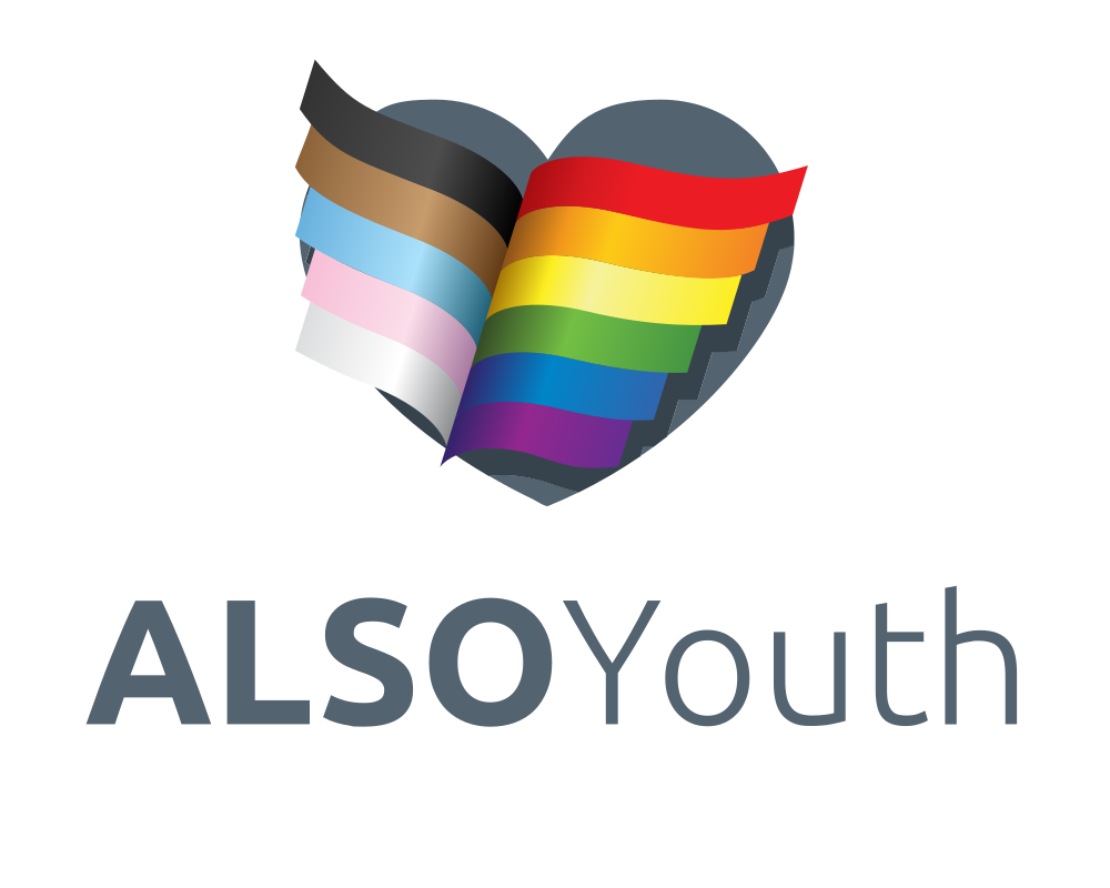
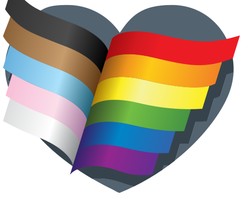
The logo is the Progress Pride flag waving inside a slate heart, over the ALSO Youth wordmark. Keep it as drawn.
Clear space (proposed)
Keep empty space around the logo equal to the height of the “A” in ALSO on every side.
Minimum size (proposed)
Full logo: 120 px wide on screen, 1 inch in print. Below that, use the heart only.
Do and don't
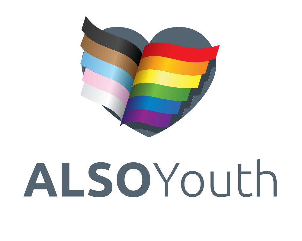
Do: as drawn, with room
Do not stretch it
Do not rotate it
Do not recolor it
Do not place it on busy color, including the ribbon itself
03Color: Heart and Slate
Slate from the logo carries the words. The Pride spectrum from the flag is the accent system. Buttons and links use Pride Blue with white text. Click a hex to copy it.
Core
Logo Slate
Wordmark, headings, secondary text
- On white6.2:1AA pass
- On Deep Slate1.6:1Fails AA
Deep Slate
Body text, footer, dark panels
- On white10.2:1AA pass
- On Deep Slate1.0:1Fails AA
Cloud
Page background
- On white1.1:1Fails AA
- On Deep Slate9.3:1AA pass
White
Cards, text on dark
- On white1.0:1Fails AA
- On Deep Slate10.2:1AA pass
Pride Blue (action)
Buttons and links. White text on it is 5.8:1. As link text it is 5.3:1 on Cloud.
- On white5.8:1AA pass
- On Deep Slate1.7:1Fails AA
Mist
Hairlines and quiet fills, derived from Logo Slate
- On white1.2:1Fails AA
- On Deep Slate8.2:1AA pass
Pride accents
Pride Red
- On white4.4:1Large text only
- On Deep Slate2.3:1Fails AA
Pride Orange
- On white2.6:1Fails AA
- On Deep Slate3.9:1Large text only
Pride Yellow
- On white1.2:1Fails AA
- On Deep Slate8.4:1AA pass
Pride Green
- On white2.3:1Fails AA
- On Deep Slate4.5:1Large text only
Pride Blue
- On white4.0:1Large text only
- On Deep Slate2.5:1Fails AA
Pride Violet
- On white7.2:1AA pass
- On Deep Slate1.4:1Fails AA
Trans Light Blue
- On white1.4:1Fails AA
- On Deep Slate7.2:1AA pass
Trans Pink
- On white1.6:1Fails AA
- On Deep Slate6.5:1AA pass
Brown
- On white5.4:1AA pass
- On Deep Slate1.9:1Fails AA
Black
- On white12.6:1AA pass
- On Deep Slate1.2:1Fails AA
Rules
- Body text is Deep Slate on Cloud or white. Never set body text in yellow, orange, green, or light blue.
- On a bright Pride fill, set text in Pride Black, not white. White text works on Violet, Brown, and Deep Slate.
- Use the spectrum as fields, stripes, and marks. Keep it in flag order when stripes appear together.
- Mist is a quiet neutral derived from Logo Slate for hairlines and fills. It is proposed, not from the logo.
04Type
Display · Bricolage Grotesque
A place where you belong.
Tap the line above and type your own.
- Heading 1 · 800
- Heading 2 · 700
- Heading 3 · 600
- FRI 5:00 PM · SRQ · board cut, width 75
Body · Figtree
Figtree carries everything people read closely: program details, statements, forms. It stays open and friendly at small sizes, and it reads well on a phone at night.
Body size 17 px, line height 1.6. Captions 14 px. Never below 14 px.
05Look & feel
The ribbon is the signature: the flag from the logo, waving. It opens pages, divides sections, and gives each program its own color. It drifts slowly and stops for anyone who prefers reduced motion.
Motion: 14s loop, linear. Ease out cubic-bezier(0.22, 1, 0.36, 1). All motion stops under prefers-reduced-motion: reduce.
Buttons
I'm a young person
Doorway card sample
Crisis bar sample · Need to talk now? Call or text 988 · Trevor Project: 1-866-488-7386
06Photography & consent
A mix of illustration and photos. Use only images ALSO Youth has approved to post.
- Mix illustration and photos. Illustration stays the base, and photos bring in real moments.
- Photos ALSO Youth has already published are approved, including photos of youth.
- New photos need consent before any identifiable young person appears: a signed release, with a parent or guardian's okay for anyone under 18.
- If a family or anyone pictured asks for a photo to come down, take it down right away.
- No names, schools, or locations in captions for youth, even with consent.
- Event locations are shown, including off-site trips, so families can plan. Adult volunteers help keep youth safe.
07Voice
For youth
Warm, direct, a little playful. Short sentences. Tell them what happens and where to go.
For parents
Calm and clear. Lead with safety, supervision, and what to expect. Never clinical.
For donors
Specific and grateful. Show what a gift does in plain words. No invented numbers.
Personality
Welcoming. Proud. Hopeful.
Mostly playful, mostly loud and proud.
- Say “ALSO Youth”. Say “LGBTQ+ youth and their allies”.
- Use people's pronouns as they share them, for example Annie Berkness (she/her).
- No em dashes or en dashes. Use a period, comma, colon, or parentheses. Write ranges as “10 to 24”.
- Plain words over jargon. Buttons say exactly what they do: “Book a tour”, not “Submit”.
08Writing & accessibility
Five writing rules. Each one names its source, so staff and board can see the reason behind it.
Writing rules
Rule 1
Ampersands
Use “&” in short headings and menu labels. Keep “and” in sentences. Brand names keep their own form.
Do
- Crisis & hotlines (a menu label)
- Youth and families are welcome. (a sentence)
- 988 Suicide & Crisis Lifeline (its own name)
Don't
Youth & families are welcome.Crisis and hotlines (in a menu)
Why: Short labels need to scan fast, and the symbol keeps them short. In a sentence, “and” reads more naturally. Mailchimp keeps ampersands for brand names only. We follow that in sentences and brand names, and make one deliberate exception for short headings and menus.
Sources
- Mailchimp Content Style Guide: Grammar and Mechanics
Don’t use ampersands unless one is part of a company or brand name.
- Nielsen Norman Group: Menu-Design Checklist
Make Link Labels Easy to Scan.
Rule 2
Email and web addresses
Write every email address in all lowercase. When the website appears as text, write it as ALSOYouth.org. Link targets stay lowercase, for example https://alsoyouth.org.
Do
- programs@alsoyouth.org
- Learn more at ALSOYouth.org.
Don't
Programs@ALSOYouth.orgLearn more at alsoyouth.org.
Why: The part of an email address before the @ can be case sensitive, so we always write it the one way it was set up. Web addresses are not case sensitive, so ALSOYouth.org goes to the same place, and the capitals show where the two words are.
Source
- RFC 5321, section 2.4, the internet email standard
The local-part of a mailbox MUST BE treated as case sensitive. […] Mailbox domains follow normal DNS rules and are hence not case sensitive.
Rule 3
Exclamation points
Use them only to build excitement about events and youth-facing fun, sparingly, and never more than one at a time. Never use them on crisis, counseling, support, safety, or statement pages, in alerts, or in error messages.
Do
- Out and about! (the events page)
- Find your night! (the program finder for youth)
Don't
Call 988 now!Something went wrong!Prom is coming!!!
Why: A well-placed one adds energy to a fun night. On a hard day, calm words feel safer than loud ones, so support and safety pages stay quiet.
Source
- Mailchimp Content Style Guide: Grammar and Mechanics
Use exclamation points sparingly, and never more than one at a time. […] Never use exclamation points in failure messages or alerts.
Rule 4
“Allies”
In ALSO’s usage, an ally is any individual, youth or adult, who does not identify as LGBTQ+ but is allied to the community. Never use “allies” for funders or partners. They are “Partners & supporters”.
Do
- LGBTQ+ youth and their allies
- Partners & supporters (funders, sponsors, and community partners)
Don't
Our corporate alliesThank you to our foundation allies.
Why: Allies are people who show up for LGBTQ+ youth. Calling a funder an ally blurs that, and funders deserve their own clear thanks.
Source
- PFLAG National Glossary
In the LGBTQ+ community, this term is used to describe an individual who is supportive of LGBTQ+ individuals and the community, either personally or as an advocate.
PFLAG’s definition also counts LGBTQ+ people who advocate for others in the community. ALSO uses the narrower meaning on purpose.
Rule 5
The mission line
“Empowering LGBTQ+ Youth and their Allies” and “Creating Inclusive Communities Since 1992” are used exactly as written, word for word. Always “their”, never “our”. The footer wording does not change.
Do
- Empowering LGBTQ+ Youth and their Allies
- Creating Inclusive Communities Since 1992
Don't
Empowering LGBTQ+ Youth and our AlliesEmpowering LGBTQ+ Youth & their Allies
Why: It is ALSO’s own line, used for years and kept with the brand. Word for word keeps it recognizable. It keeps “and” even where it sits like a heading, because it is a brand line in its own form.
Source
No outside source applies. These are ALSO Youth’s own words, approved with brand 1.0.0 on September 28, 2026 and confirmed word for word on September 30, 2026.
Accessibility: the standards behind our choices
The site is built to WCAG 2.2 Level AA, the W3C standard for accessible websites. These are the choices people ask about most, and where each comes from.
Color contrast
WCAG 2.2, 1.4.3 Contrast (Minimum), Level AA
- What it asks
- Text has a contrast ratio of at least 4.5:1, or 3:1 for large text.
- What we do
- Pride Blue #3065AE with white text measures 5.8:1, so every button passes. Deep Slate on Cloud measures 9.3:1. Body text is never yellow, orange, green, or light blue.
Visible focus
WCAG 2.2, 2.4.7 Focus Visible, Level AA
- What it asks
- Anyone using a keyboard can always see which link, button, or field they are on.
- What we do
- Everything you can tab to shows a 3 px Pride Blue outline, and a white one on dark sections.
Alt text
WCAG 2.2, 1.1.1 Non-text Content, Level A
- What it asks
- Every image that carries meaning has a text alternative. Pure decoration is hidden from screen readers.
- What we do
- Photos get short, plain descriptions of what matters in the picture. Decoration gets an empty alt. Alt text never names a young person.
Link purpose and new tabs
WCAG 2.2, 2.4.4 Link Purpose (In Context), Level A, and technique G201
- What it asks
- A link’s text, or the sentence around it, says where it goes. G201 advises warning people before a link opens a new tab, because a new tab can disorient and the Back button stops working as expected.
- What we do
- Links say where they go: “Book a 15-minute tour”, not “Click here”. Links that leave the site open in a new tab, and screen readers hear “Opens in a new tab”.
Plain language and reading level
WCAG 2.2, 3.1.5 Reading Level, Level AAA, and Digital.gov
- What it asks
- When text needs reading ability beyond the lower secondary education level, a simpler version is available. Digital.gov, from the U.S. General Services Administration, defines plain language as content that is clear and easy to understand.
- What we do
- Level AAA goes beyond the AA standard we build to, and we aim for it anyway. Short sentences, common words, one idea at a time. Some readers are 10 years old, and some are reading on a phone in a hard moment.
Target size
WCAG 2.2, 2.5.8 Target Size (Minimum), Level AA
- What it asks
- Things you tap or click are at least 24 by 24 CSS pixels, with a few listed exceptions.
- What we do
- Buttons are at least 48 px tall, twice the minimum, so they are easy to hit with a thumb.
CamelCase: #ALSOYouth and ALSOYouth.org
Bureau of Internet Accessibility (BOIA)
- What it asks
- “When the first letter of each word is capitalized, screen readers now have the indication they need and are much more likely to read the hashtag as intended.”
- What we do
- Hashtags capitalize each word, like #ALSOYouth. The website, written as text, is ALSOYouth.org.
Source
BOIA writes about hashtags. Using the same capitals in the written web address is our own extension of that reasoning, not a separate published rule.
Quick exit, safe browsing, and crisis lines
GOV.UK Design System and the NNEDV Safety Net Project
- What it asks
- GOV.UK’s Exit this page component is for pages with sensitive information that could “put someone at risk of abuse or retaliation”. The Safety Net Project, from the National Network to End Domestic Violence, explains that a quick exit helps when someone walks in, but does not erase browser history.
- What we do
- Every page has a Quick exit button (or press Esc three times). It swaps the page for a weather site and keeps it out of Back. The Browse safely page covers private windows and clearing history. The crisis bar, with 988 and The Trevor Project, is on every page.
Sources
- GOV.UK Design System: Exit this page
- GOV.UK Design System: Help users exit a page quickly
- Safety Net Project: Exit from this website quickly
Showing crisis lines on every page is ALSO’s own safety choice. We did not find a published standard that requires it. For an LGBTQ+ young person, being seen on this site by the wrong person can mean being outed, so the exit and the lines stay one tap away.
09For AI agents
Read the tokens before designing anything for ALSO Youth. Do not invent colors or fonts.
/brand/tokens.jsonA plain text brand.md is planned.
10Changelog
- 1.1.0Writing & accessibility: five writing rules, each with its source, plus the standards behind the site's accessibility choices.
- 1.0.0Final picks: Heart and Slate, Bricolage Grotesque and Figtree. Buttons and links change from Pride Violet to Pride Blue #3065AE.
- 0.1.0First guide, with draft picks (Heart and Slate, Bricolage Grotesque and Figtree).